Ihor Masalov

Latest update: May 20, 2025
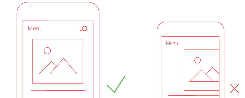
Touch targets represent the interactive components on a webpage, such as links, buttons, form elements, and ads, that users engage with on mobile devices. Ensuring these elements are sufficiently large and spaced is crucial for a user-friendly mobile experience.
Correctly sized touch targets minimize user frustration by preventing accidental taps and making navigation more intuitive. On smaller screens like smartphones, the challenge intensifies as elements shrink, necessitating careful design to keep touch targets accessible.
Google suggests that essential touch targets, like menu buttons or call-to-action links, should measure at least 48 CSS pixels in height and width (approximately 7mm), ensuring they’re easily tappable without zooming.
Although primary touch targets warrant a larger size, not all elements require such dimensions. For text links within paragraphs, ensuring readability typically suffices, provided links aren’t clustered too closely. Google recommends a minimum of 32 CSS pixels (about 5mm) spacing between smaller touch targets to prevent overlap and mis-taps.
Correct viewport settings are vital for responsive designs, ensuring touch targets automatically adjust to various screen sizes without compromising usability.
Buttons should stand out against text in size and design to function effectively as calls to action. A button that blends too closely with body text risks being overlooked or mistakenly tapped.
Advertisements, particularly those from networks like Adsense, require ample spacing to prevent accidental clicks—a crucial consideration for maintaining user control and adhering to network policies.
The appearance of touch targets on mobile devices depends on several factors, including font size, media queries, and viewport settings, all of which contribute to the final user experience.
Utilize mobile SEO tool to assess whether your page’s touch targets meet size requirements, helping you identify and rectify potential usability issues.
| Aspect | Before Optimization | After Optimization |
|---|---|---|
| User Experience | Frustrating with accidental taps | Smooth and intentional navigation |
| Page Interaction | High bounce rate due to mis-taps | Increased engagement and lower bounce rates |
| SEO Performance | Lower rankings due to poor mobile usability | Improved rankings with enhanced mobile user experience |
| Maintenance | Frequent user complaints require constant adjustments | Streamlined experience reduces the need for adjustments |
Optimizing touch targets emerges as a cornerstone of mobile web design. By integrating these strategic enhancements, developers not only elevate the user experience but also contribute to the broader objectives of mobile-first design, underscoring the importance of precision and intentionality in interactive elements.
As mobile browsing continues to evolve, the commitment to optimizing every touchpoint reflects a broader dedication to accessibility, usability, and the seamless integration of form and function in the digital realm.