


Latest update: May 20, 2025
Mobile-first design has emerged as a transformative approach in web development, advocating for the creation of online experiences tailored specifically for mobile devices before scaling up to larger screens. This paradigm shift overturns traditional methodologies that traditionally prioritized desktop designs, highlighting the importance of addressing the constraints and leveraging the opportunities presented by mobile environments right from the outset.
What is Mobile First Design?
Mobile-first design is a development philosophy that starts by creating an online experience for mobile devices first and then scaling up to larger screens. This strategy reverses the traditional approach, which often began with desktop designs. The core of mobile-first design lies in addressing the constraints and leveraging the opportunities of mobile environments from the outset.
Why Mobile First Design is Important?
The importance of mobile-first design stems from the growing prevalence of mobile devices as the primary means of accessing the internet. This design approach ensures websites are optimized for the vast array of mobile screens and user conditions, enhancing accessibility and user experience. Additionally, it aligns with Google’s mobile-first indexing, improving a site’s SEO performance.
Advantages and Disadvantages of Mobile First
Advantages
- Enhanced User Experience: Mobile-friendly design for readability and ease of navigation for users;
- Improved Performance: Focuses on optimizing for speed and responsiveness, crucial for mobile users;
- Better SEO Ranking: Google’s mobile-first indexing favors mobile-optimized sites, potentially boosting your search engine ranking.
Disadvantages
- Design Constraints: The limited space on mobile screens can restrict design elements and creativity;
- Complex Development: Designing for mobile first can require more planning and testing across various devices, increasing the complexity of the development process.
How to Implement Mobile First Design?
Implementing mobile-first design involves several key steps:
- Content Prioritization: Start by defining the core content and functionality needed by mobile users;
- Responsive Design: Use flexible grids, fluid images, and media queries to create layouts that adapt to any screen size;
- Optimize Interactions: Design touch-friendly interfaces, considering thumb reach and tap targets to improve usability.
How ChatGPT Can Help Implement Mobile First Design?
ChatGPT can assist in several ways:
- Generate concise, impactful content suited for mobile screens;
- Provide examples of responsive design techniques and CSS media queries;
- Offer insights on optimizing mobile interfaces for usability and engagement.
The Best Tools to Use for Mobile First Design
Several tools can enhance the mobile-first design process:
- Responsive Frameworks: Bootstrap and Foundation offer pre-designed components for building responsive sites;
- Design and Prototyping: Tools like Sketch, Adobe XD, and Figma allow for designing and testing mobile-first interfaces;
- Performance Testing: Google PageSpeed Insights and Lighthouse analyze and suggest optimizations for mobile performance.
The Best Practice of Mobile First Design
Best practices include:
- Start Small: Begin the design process with the smallest screen in mind and scale up;
- Test Extensively: Use emulators and real devices to test the design across different screen sizes and operating environments;
- Keep It Simple: Embrace minimalism to ensure content and functionality are not overwhelmed by design elements.
Embracing mobile-first design is not just about adapting to the constraints of mobile devices but also about seizing the opportunity to create more accessible, performant, and user-friendly web experiences. By prioritizing mobile users from the start, designers and developers can ensure their websites meet the needs of today’s diverse and mobile-centric audience.
The Best Practice of Mobile First Design Reddit Answers
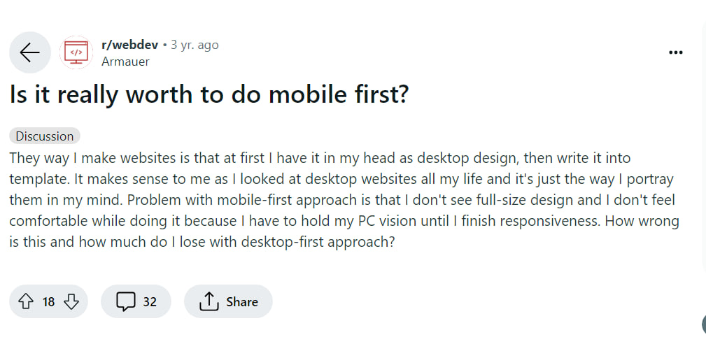
The user describes their usual process of designing websites by starting with the desktop version, which they find more intuitive and comfortable based on their familiarity with desktop interfaces. They express discomfort with the mobile-first approach because it forces them to delay their vision for the full-sized desktop design until they’ve addressed mobile responsiveness. The user is seeking insight on how problematic this desktop-first approach might be and what they might be losing by not adopting a mobile-first strategy.
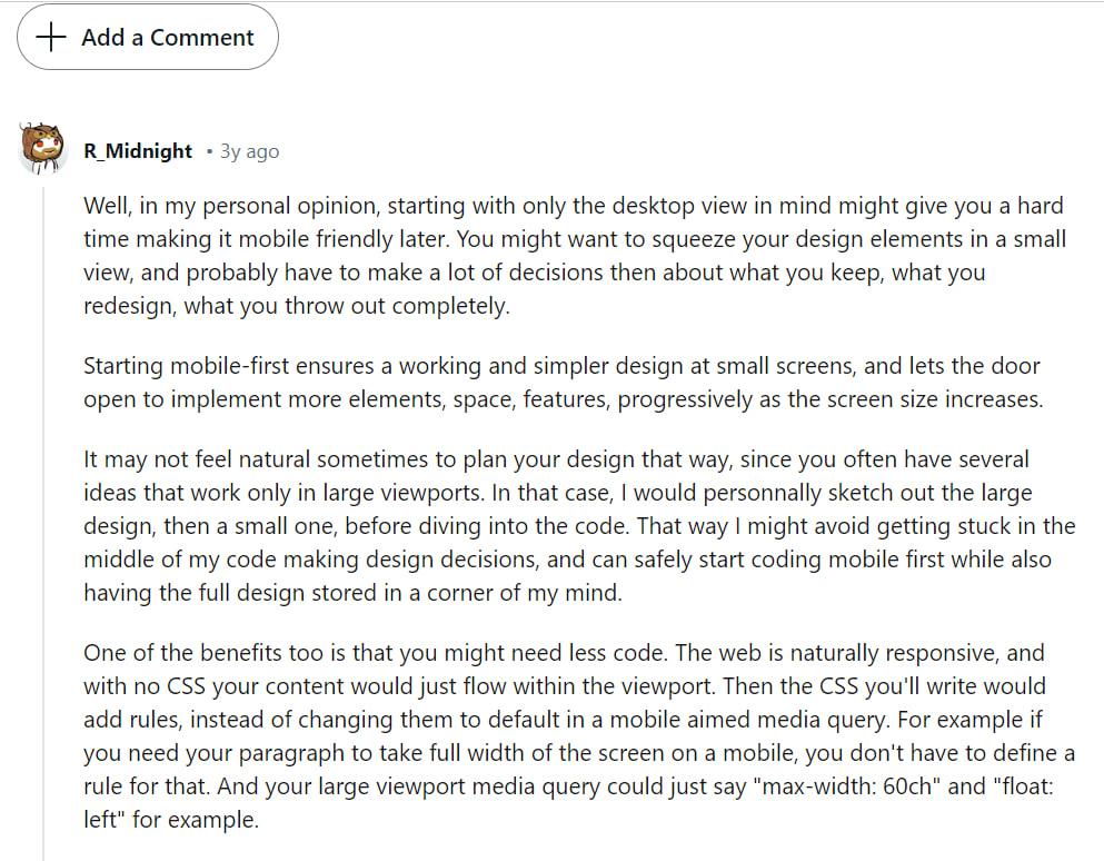
The user discusses the challenges of adopting a desktop-first approach in web design, noting that it can complicate the transition to mobile-friendly designs due to the need to adjust or discard elements to fit smaller screens. They advocate for a mobile-first approach, suggesting it simplifies the initial design for small screens and allows for easier scaling up to larger screens. The user also recommends sketching both large and small designs before coding to avoid mid-development design dilemmas. They highlight that starting with mobile-first could lead to using less code, as the web is naturally responsive, and the initial mobile design often requires fewer overrides when expanding to larger screens.
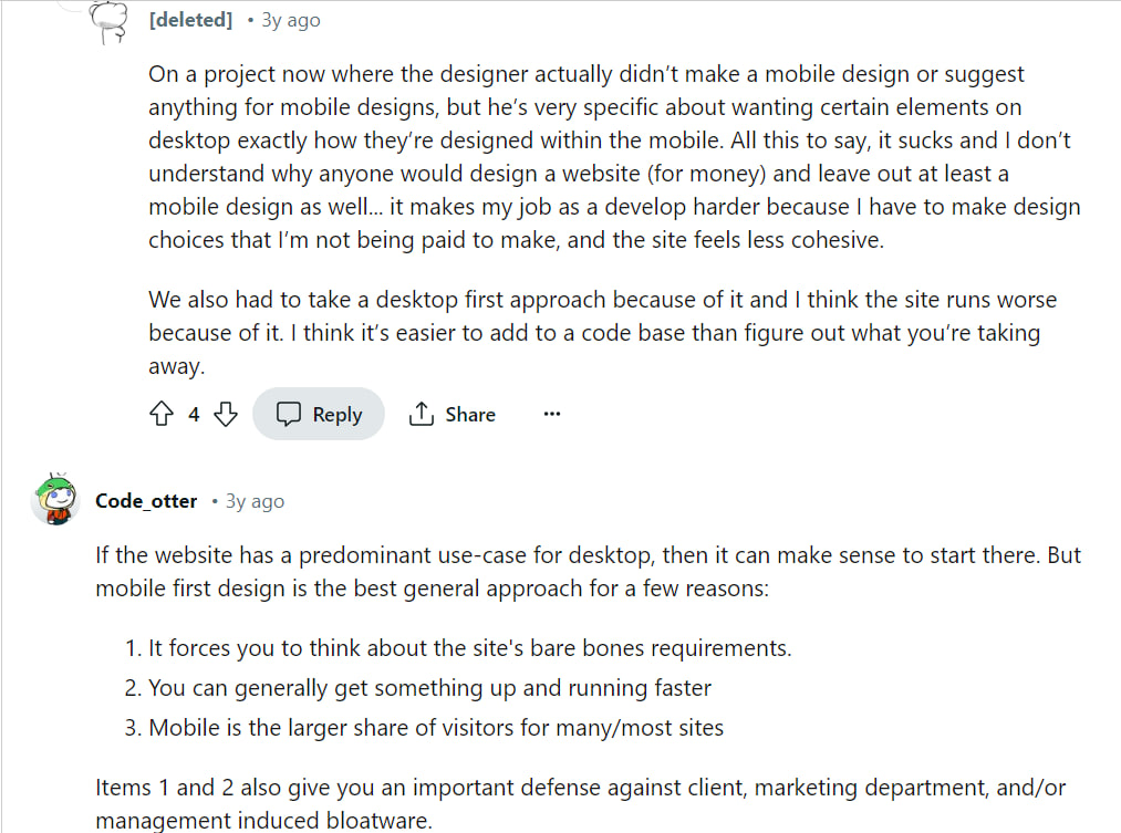
The user shares their frustration with a project where the designer did not provide a mobile design, requiring them to make unexpected design decisions during development. This situation led to a desktop-first approach, which they believe compromises the site’s performance and cohesion. They express that a mobile-first design is typically more efficient, as it allows for easier scaling up rather than having to scale down. Another commenter, Code_otter, argues that while desktop-first might be suitable for websites predominantly used on desktops, mobile-first is generally better because it simplifies the design process, speeds up development, and accommodates the majority of users who access sites via mobile devices.
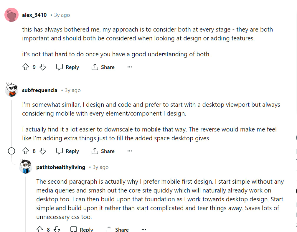
The user describes their approach to web design, emphasizing the importance of considering both desktop and mobile platforms simultaneously throughout the design process. They believe that understanding both platforms well makes this approach feasible. Another commenter, subfrequencia, prefers starting with a desktop view but keeps mobile considerations in mind for each design element, finding it easier to scale down to mobile. A third commenter, pathtohealthyliving, advocates for a mobile-first approach, highlighting the efficiency of starting with a simple base that naturally works on desktop and then building upon it for larger screens, which they find saves unnecessary coding.
Conclusion
Adopting a mobile-first design strategy prepares your website to meet the demands of a mobile-centric audience, ensuring it performs superbly across all devices. By focusing on the nuances of mobile interaction and prioritizing content delivery, developers and designers can create experiences that are not only visually appealing but also deeply functional and user-centric.


